I was tasked to do the layout for Concepcion Industrial Corporation's 2018 annual report. We were free to explore the overall look, starting with the cover design. Having worked with CIC in the past, they wanted to keep the layout simple but modern while keeping the palette within the brand's identity. The annual report would be distributed to the company's stakeholders in digital format.
Cover studies
[Left column] The first study used the brand logo's shapes to show the many ways the company has provided comfort and convenience to homes, businesses, and industrial spaces with their products and services.
[Center column] The second study showed the brand continuously striving for quality and excellence. As a long-established company in the Philippine market, the brand keeps finding new ways to innovate and stay relevant. The study showed this by using the "C" curve of the logo to show the brand is a forward-thinking company that values its stakeholders.
[Right column] The third study took a more experimental approach to the modern look, using geometric shapes and patterns representing building blocks to the brand's foundations and values that have helped shape the company's success and continues to do so.
The first and second studies were shown to the client as they were more in line with the client's "simple but modern" direction.
Final cover
Revisions on the chosen cover study were further made, with the client opting for a landscape orientation.
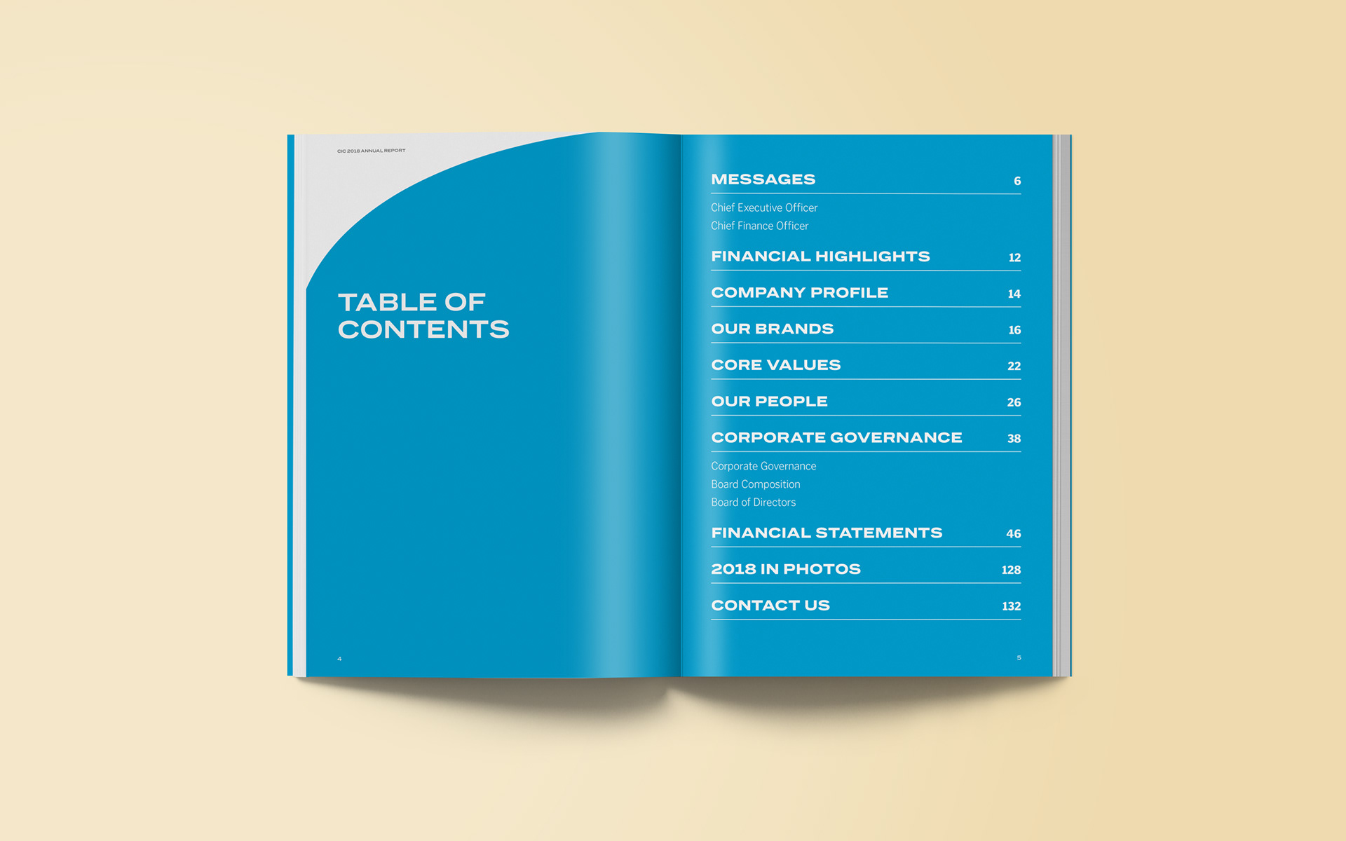
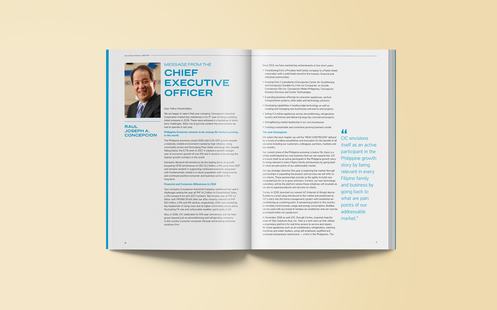
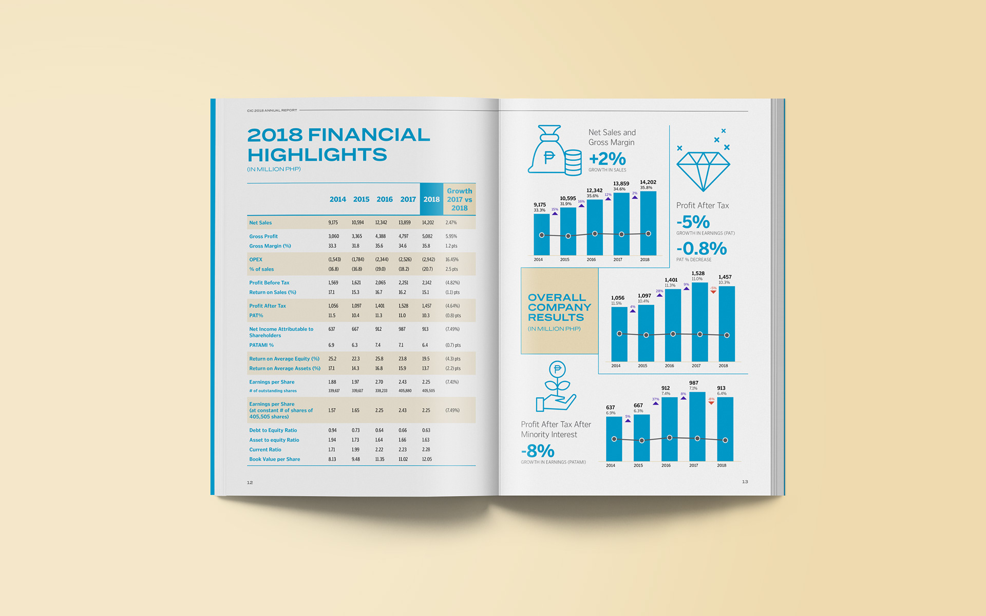
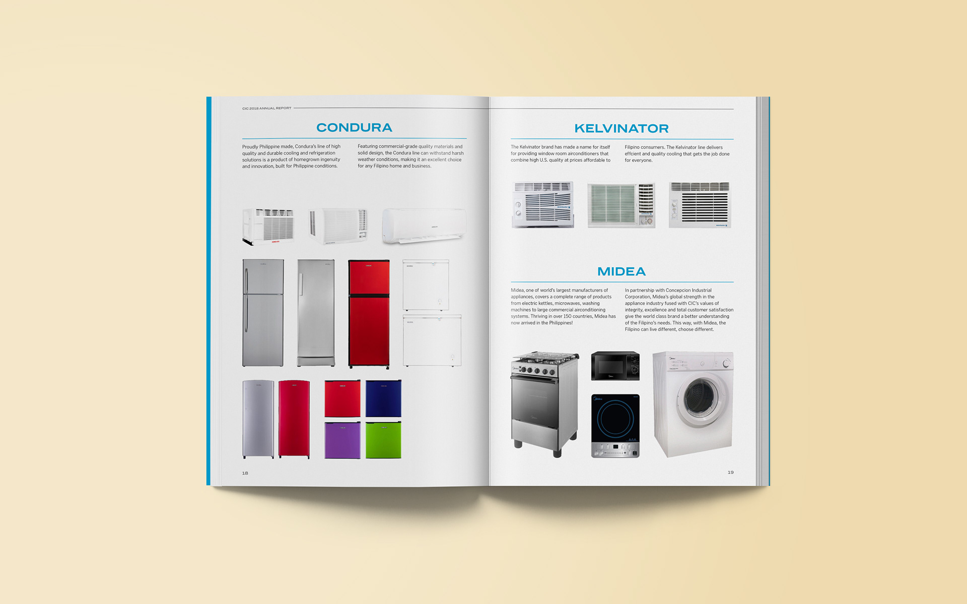
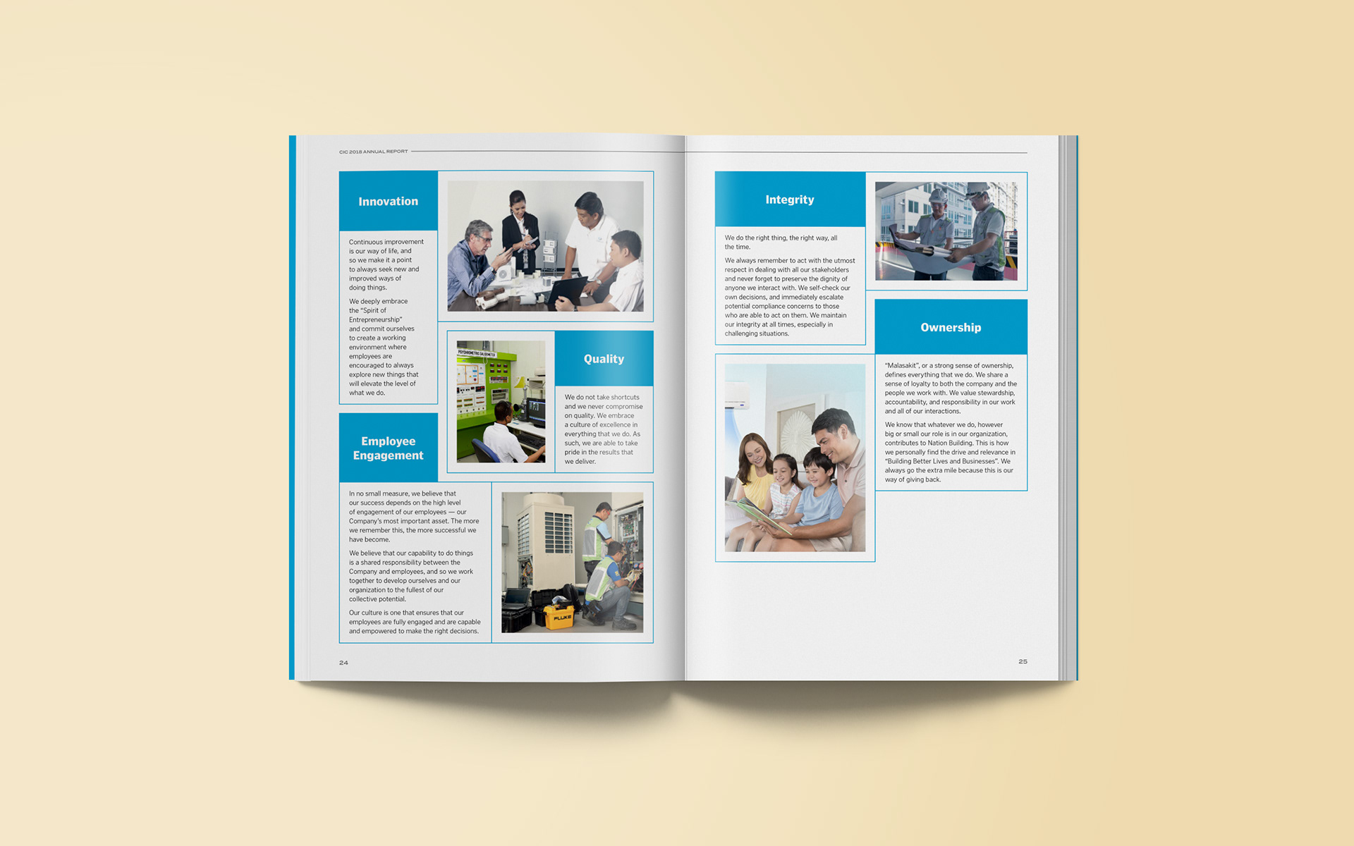
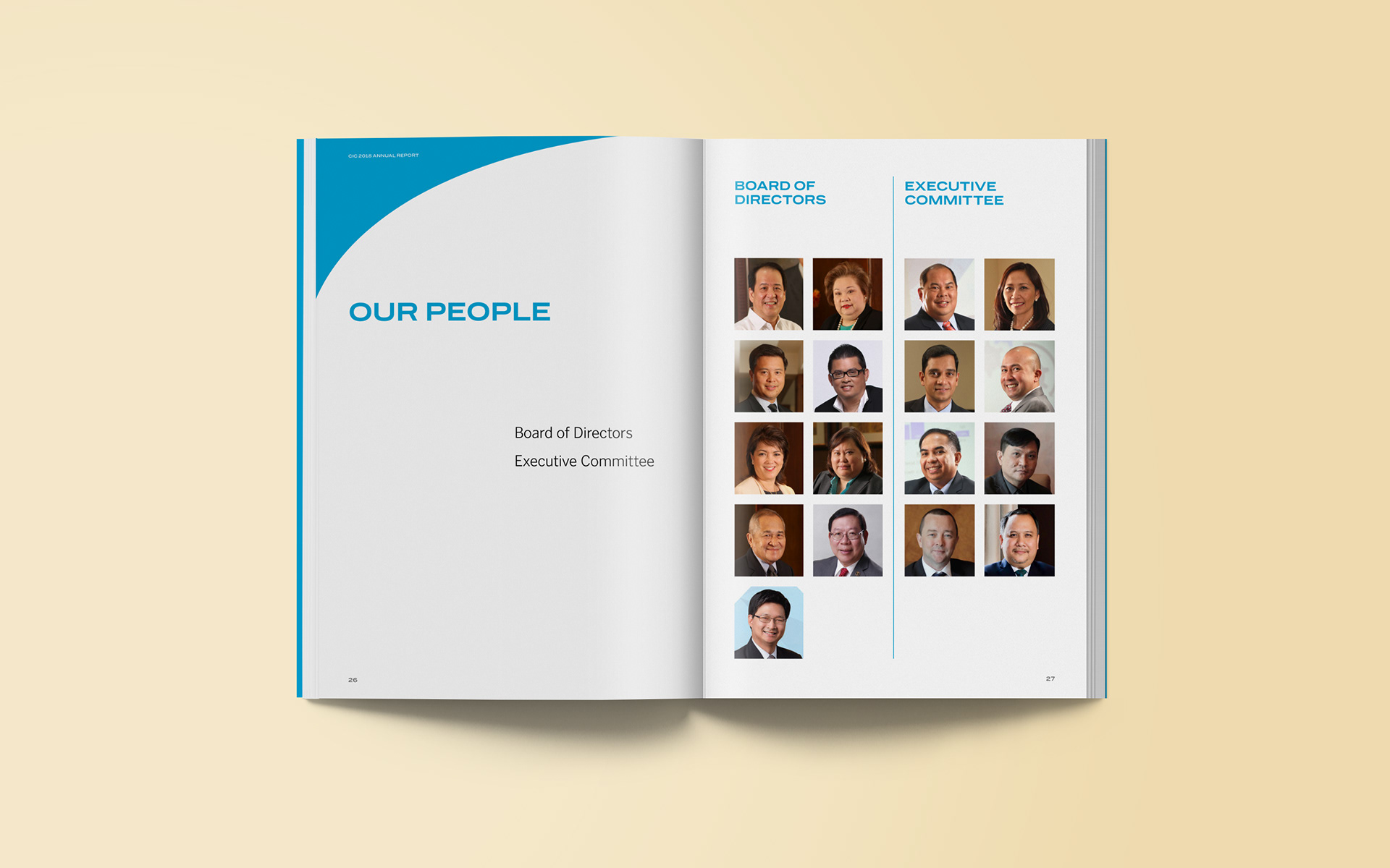
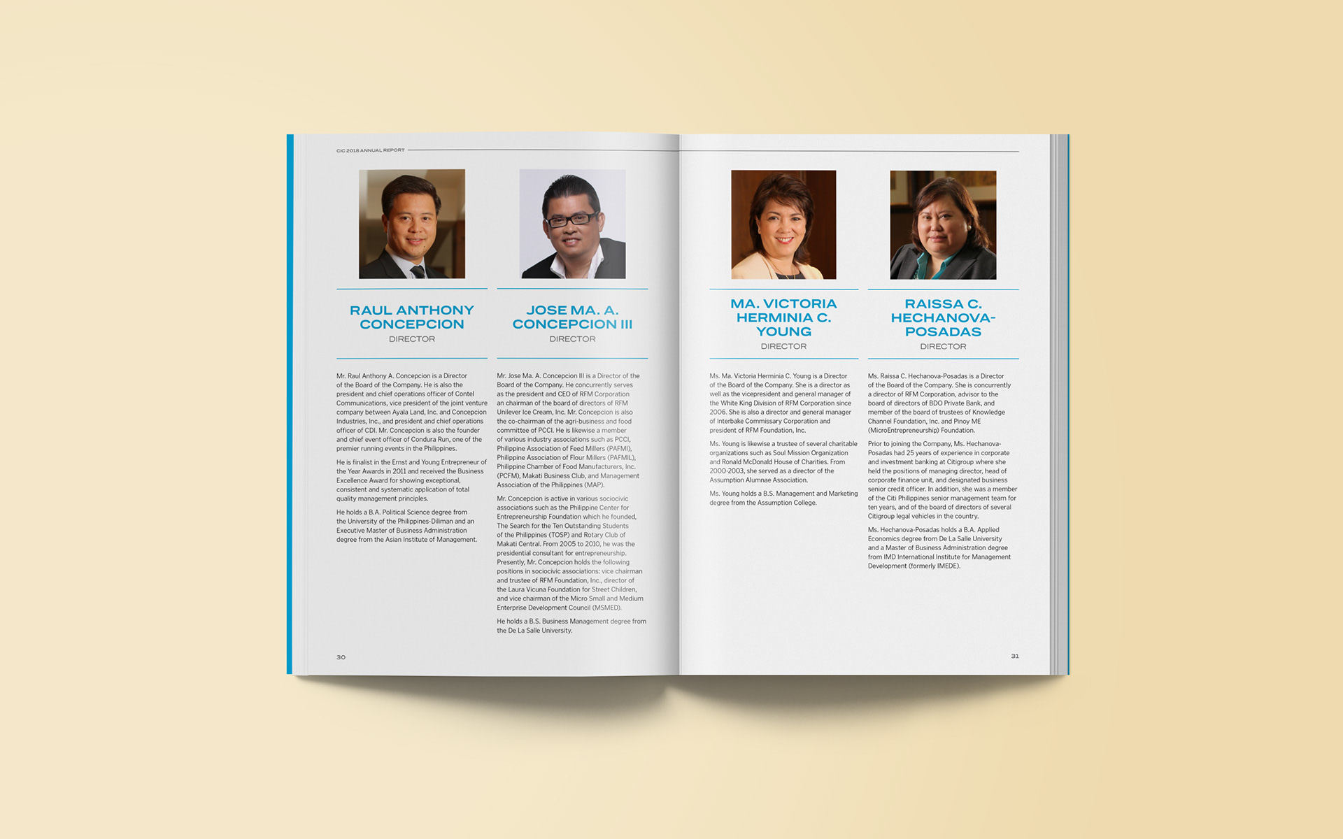
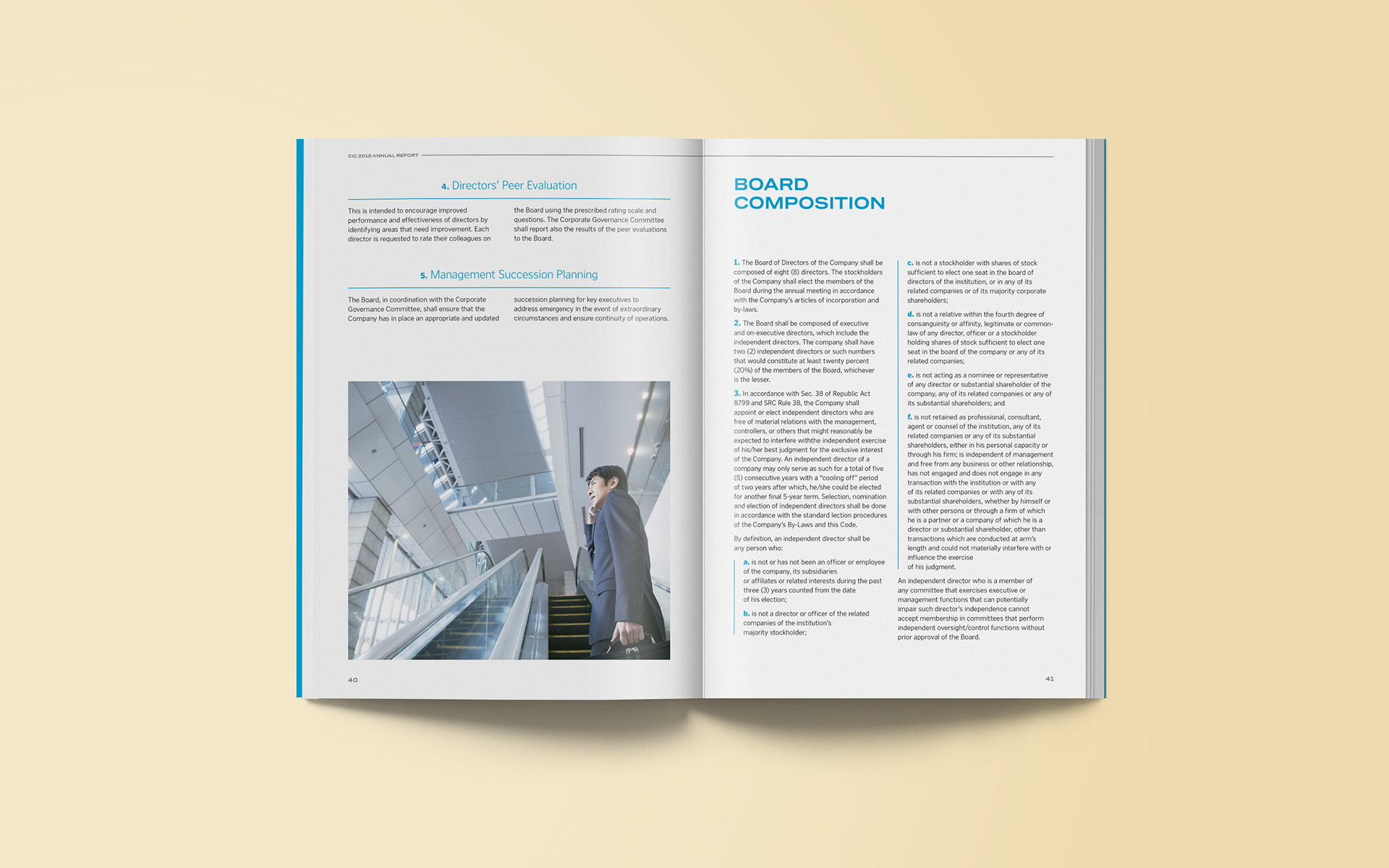
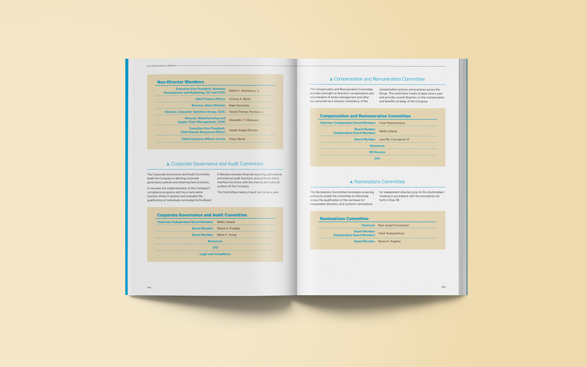
Final layout was distributed as a digital format and so pages were exported as spreads to keep the landscape orientation consistent with the cover. Overall layout was kept clean and flexible considering that some chapters were heavier on text, while other chapters used more photos.
